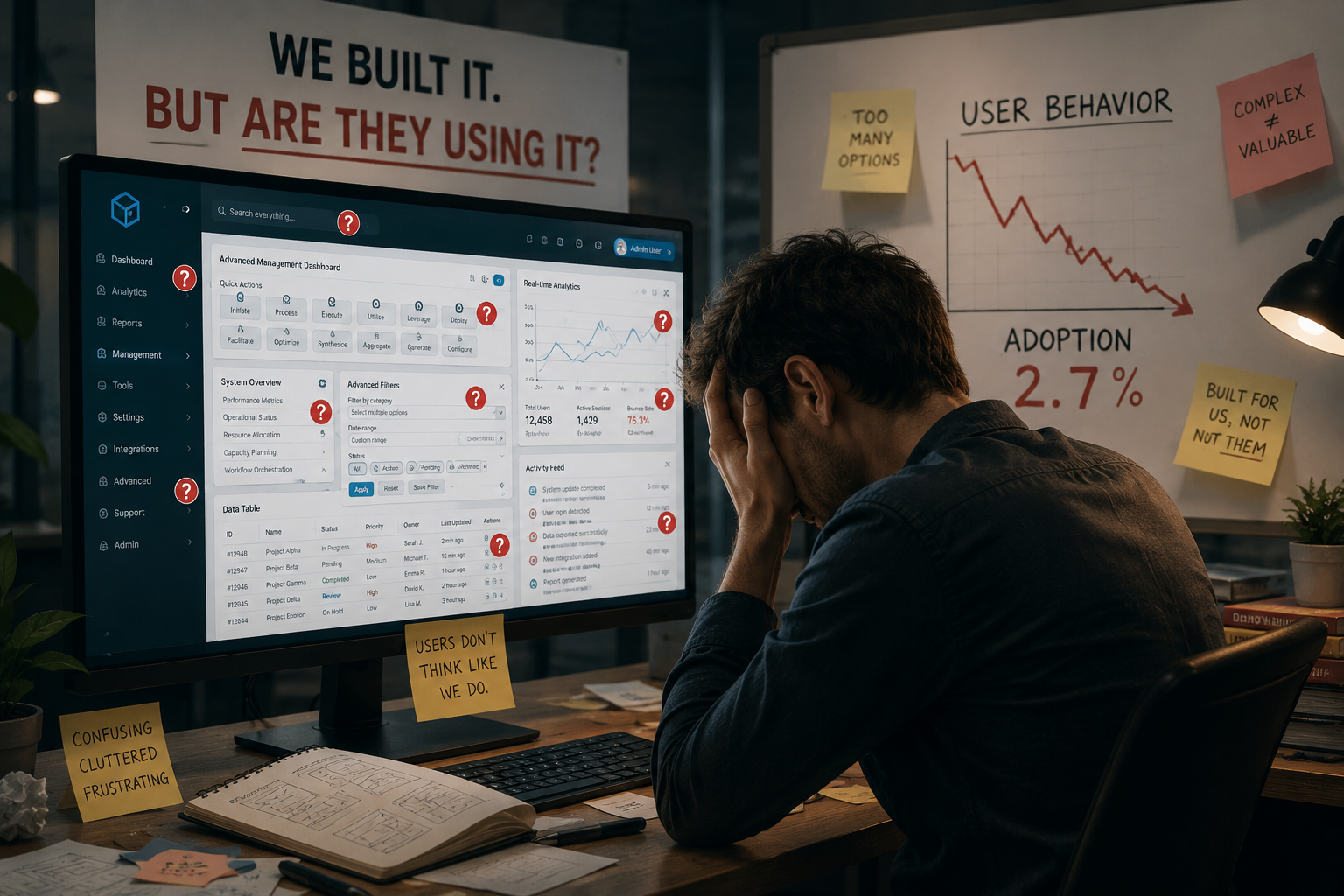
I watched a product team spend six weeks redesigning a checkout flow last quarter. The meetings were extensive. The stakeholder reviews were thorough. The Figma file had hundreds of frames with every edge case annotated and every transition mapped. When the redesign finally shipped, conversion dropped by eleven percent. Not because the design was bad. In a vacuum, it was cleaner and more modern than what it replaced. Conversion dropped because the team optimized for the wrong audience. They designed for the people in the room, not the people actually using the product.
This is the biggest UX mistake companies still make in 2026, and it has nothing to do with tooling or methodology or design systems. It has everything to do with who gets to influence design decisions and whose voice carries the most weight when tradeoffs are being made. Internal stakeholders evaluate designs based on how they look in presentations and how they align with brand guidelines and how they satisfy departmental requirements. Actual users evaluate designs based on whether they can complete a task without wanting to throw their device across the room. These two evaluation criteria produce different designs. When internal consensus drives decisions, users lose. And when users lose, the business loses, just with a delay that makes it hard to connect the cause to the effect.
The Conference Room Is Not Your User Base
Design reviews follow a predictable pattern that has nothing to do with how users experience a product. Someone presents designs on a large monitor in a well-lit room. Everyone has fast internet and recent hardware. Everyone understands the product deeply because they built it. Everyone knows what the buttons are supposed to do because they discussed them in previous meetings. Under these conditions, almost any design looks usable. The navigation makes sense because the reviewers already know where everything is. The workflows feel intuitive because the reviewers designed the workflows. The copy reads clearly because the reviewers wrote the copy. Nothing about this environment resembles the conditions under which actual users encounter the product.
Actual users are distracted and impatient and operating on older devices with unreliable connections. They do not know what your product does or how it is organized. They did not attend the meetings where the logic behind the information architecture was debated and resolved. They are not giving your design their full attention. They are trying to accomplish something specific while also managing notifications and interruptions and the general cognitive load of modern life. A design that feels clean and intuitive in a conference room can feel confusing and hostile under these conditions. The gap between the two environments is not subtle, and yet it is systematically ignored in most design processes because testing in realistic conditions is harder than reviewing in conference rooms. Harder does not mean optional. It means neglected, and neglected gaps between design assumptions and user reality are where conversion losses live.
Stakeholder Requests Are Not User Needs
Every stakeholder who reviews a design has legitimate concerns. Marketing wants the messaging to be prominent and consistent. Sales wants the value proposition to be immediately clear. Legal wants the disclosures to be comprehensive and visible. Engineering wants the implementation to be feasible within existing constraints. Each of these perspectives matters. None of them represents what users actually need from the product. Users do not care about departmental requirements. They care about whether they can find what they came for and complete their task without friction. Every element added to satisfy an internal stakeholder adds cognitive load for the user. Every extra field in a form. Every additional step in a flow. Every banner and popup and disclosure stacked on top of the experience like sediment.
The accumulation is invisible to the internal team because each addition was individually justified. Marketing's banner made sense when it was added. Legal's disclaimer was necessary when it was added. Sales' testimonial section had data backing its effectiveness when it was added. But users experience the cumulative result, not the individual justifications. They encounter a product that feels heavy and cluttered and difficult to navigate, and they do not know why. They just know it feels harder than it should. The conversion data reflects their frustration, but the data is aggregated and delayed and rarely traced back to the specific decisions that produced it. So the decisions stand, and more get added, and the product slowly drifts further from what users actually want because users were never in the room when the tradeoffs were made.
The Metrics That Actually Measure User Suffering
Most product teams track metrics that make the business feel good. Monthly active users. Revenue growth. Feature adoption rates. These are important, but they are lagging indicators of user experience. By the time they move, the damage is already done. The user who struggled with your checkout flow last Tuesday did not file a bug report. They did not send an email explaining their frustration. They just left, and their departure is invisible in the aggregate data until enough people have done the same thing that the trend line finally bends. By then, the problem has been live for weeks or months, silently converting potential customers into lost opportunities.
The metrics that actually reveal UX problems are the ones that measure friction directly. Task completion rates for core workflows. Time-on-task for frequent operations. Error rates on form submissions, broken down by field so you can see exactly where users get stuck. Support ticket volume categorized by the interface element that caused the confusion. Session recordings filtered for rage clicks and rapid scrolling and other behavioral signals of frustration. These metrics are not as glamorous as revenue growth, but they predict revenue growth. When task completion improves, conversion follows. When error rates drop, retention improves. When support tickets decline, satisfaction rises. The connection between UX quality and business outcomes is direct and measurable. Organizations that ignore the leading indicators in favor of the lagging indicators are flying blind, reacting to problems months after they could have been detected and addressed.
Why User Testing Still Gets Skipped
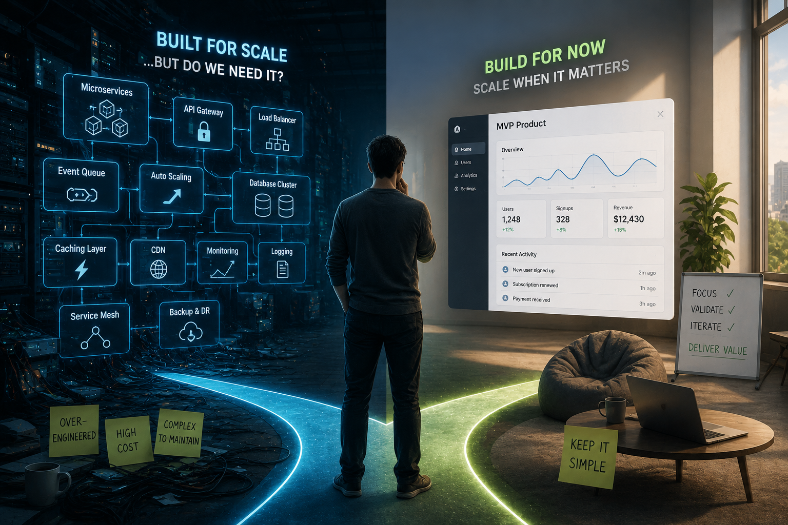
Everyone agrees that user testing is important. Almost no one does enough of it. The reasons are always reasonable. There is not enough time before the release deadline. The budget does not cover formal usability studies. The feature is too small to justify dedicated testing. The team already knows what users need based on previous research. Each of these justifications sounds legitimate in isolation. Collectively, they ensure that designs are never validated with actual users before they ship. The organization invests enormous resources in building and shipping features and almost nothing in verifying that those features work the way users expect.
The fix is not more formal usability studies with recruited participants and lab environments and comprehensive reports. Those have their place, but they are too slow and expensive for continuous validation. The fix is lightweight testing embedded in the development process. Five users, thirty minutes each, watching them attempt core tasks without guidance. Not a formal study. Just observation. Do this once a month and patterns emerge that no amount of internal review would surface. The navigation label that everyone internally thought was clear turns out to mean something different to actual users. The form field that seemed self-explanatory generates confusion and errors. The workflow that felt efficient in design review requires twice as many clicks as users expect. These discoveries are not subtle. They are immediately visible to anyone watching real users interact with the product. The only reason they remain undiscovered is that nobody is watching.
What Actually Changes When Users Are in the Room
Organizations that shift from internal consensus to external validation do not need to overhaul their entire design process. They need to make one specific change: put a real user in front of the product before it ships and watch what happens. Not a colleague pretending to be a user. Not a stakeholder role-playing the target audience. An actual person from the target audience attempting actual tasks with actual consequences. The first time a team watches a user struggle with something they thought was obvious, the dynamic shifts. The argument about whether a design element should be changed is replaced by the evidence that it must be changed. The debate about what users probably want is replaced by the observation of what this specific user actually did.
This shift does not require elaborate infrastructure. It requires commitment to making user observation a recurring part of the design process rather than an occasional special event. Once a sprint, once every two weeks, once a month. The frequency matters less than the consistency. When teams know they will watch a user interact with their work on a regular cadence, they start designing differently. They anticipate the friction points because they have seen them before. They prioritize clarity over cleverness because they have watched cleverness confuse people. They stop optimizing for stakeholder presentation and start optimizing for actual usage. The conference room still matters for alignment and coordination and decision-making. But it stops being the primary source of truth about whether a design works. That truth comes from watching users, and once a team has experienced the difference, they cannot unsee it.


Comments (2)
Rohan Deshmukh
Sophia Martinez
Post Your Comment Here: