
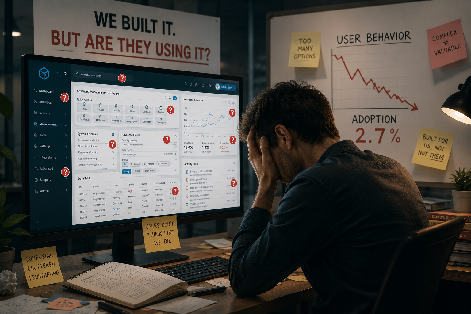
The assumption that more features create more value is persistent in digital product development, despite consistent evidence that the relationship does not hold. Feature counts appear on marketing pages and competitive comparison charts, creating pressure to match or exceed what competitors offer. Product roadmaps fill with additions. Development resources flow toward building new capabilities. And yet the products that dominate their categories are rarely the ones with the longest feature lists. They are the ones that do fewer things more reliably and more intuitively.
This divergence between feature quantity and market performance points to something fundamental about how users evaluate and adopt digital products. Features represent potential value. They describe what a product could do under ideal conditions with a motivated user willing to invest time in learning. User experience represents realized value. It describes what a product actually does for actual users under actual conditions. The gap between potential and realized value explains why feature-rich products often fail while simpler alternatives succeed. Features that users cannot find, cannot understand, or cannot use effectively might as well not exist. The investment in building them produces no return.
What User Experience Actually Measures
User experience is sometimes reduced to visual design or interface aesthetics, but this narrow definition misses what makes UX consequential for business outcomes. User experience encompasses the complete sequence of interactions between a person and a digital product, from initial awareness through ongoing usage and eventual departure. It includes measurable dimensions like task completion time and error rates. It includes perceptual dimensions like confidence and clarity. And it includes structural dimensions like navigation logic and information architecture.
A product with strong UX does not necessarily look beautiful, though visual polish can contribute to perceived quality. A product with strong UX consistently helps users accomplish what they came to do with minimal friction and maximal clarity. The user understands where they are, what they can do next, and what will happen when they do it. This understanding reduces cognitive load and allows users to focus on their goals rather than on operating the product itself. When UX succeeds, the product becomes transparent. Users stop thinking about the interface and think only about their task. When UX fails, the product becomes an obstacle. Users must think about the product instead of their goal, and every interaction requires conscious effort.
The operational definition matters because it determines what gets measured and improved. Teams that define UX narrowly as visual design optimize for aesthetics. Teams that define UX broadly as the quality of user goal achievement optimize for outcomes. The latter approach correlates more reliably with business performance.
The Feature Trap and Why Teams Fall Into It
The feature trap describes a predictable pattern in which product teams respond to competitive pressure and user requests by continuously adding new capabilities while neglecting the coherence and usability of the existing product. Each individual addition seems reasonable when considered in isolation. Users asked for this capability. Competitors offer something similar. The engineering cost appears manageable. The business case looks sound. But the cumulative effect of many such additions is a product that does many things adequately and nothing exceptionally well.
Several structural forces push teams toward the feature trap. Roadmap prioritization rewards shipping new things over refining existing things. Marketing prefers announcing additions to announcing improvements. Sales teams request features to close specific deals. User feedback channels surface requests for missing capabilities more prominently than complaints about existing friction. Each force individually is manageable. Collectively, they create strong incentives to keep adding while deferring the less glamorous work of making what already exists work better.
The products that avoid this trap do not ignore feature requests. They evaluate them against a different criterion. Not "can we build this," but "will users actually use this effectively given how they currently interact with the product." This question shifts attention from potential value to realized value. Features that would go unused or misunderstood do not get built regardless of how reasonable they appear in isolation. Resources instead flow toward making existing capabilities more discoverable, more reliable, and more intuitive. The product does fewer things, but the things it does work consistently well.
Trust as a Function of Predictability
Trust in digital products operates differently than trust in human relationships, but it is no less important for sustained engagement. Users trust a product when it behaves consistently and predictably. Clicking a button produces the expected outcome. Information appears where it is supposed to appear. The system responds to input without surprising the user with unexpected behavior. This predictability creates confidence. Users feel safe exploring because they understand the rules of the environment.
Poor UX erodes this trust through inconsistency and surprise. A button that works one way in one context works differently in another. Navigation elements shift position or disappear. Error messages appear without explanation or recourse. Each inconsistency is small in isolation but cumulative in effect. Users learn that the product cannot be relied upon to behave as expected. They become hesitant and conservative. They avoid exploring features they do not already understand because the cost of misunderstanding is unpredictable. The product's potential value goes unrealized not because users reject it but because they never feel confident enough to discover it.
Strong UX rebuilds this trust through deliberate consistency. Interaction patterns repeat predictably across the product. Visual hierarchy remains stable. Language stays consistent. Users develop accurate mental models of how the system works. This predictability reduces the perceived risk of trying new things. Users explore more features and discover more value not because the features are new but because they finally understand them well enough to use them.
Business Metrics That UX Directly Influences
The connection between UX quality and business outcomes is not merely theoretical. It appears in metrics that product teams track daily. Bounce rates measure the proportion of users who arrive and immediately leave, often because they cannot quickly determine whether the product serves their needs or how to begin using it. Time-on-task measures how long users spend accomplishing basic goals, with longer times indicating friction and confusion. Conversion rates measure the proportion of users who complete intended actions, with drops often attributable to unclear pathways or unexpected obstacles. Support ticket volume measures how often users need human assistance to use the product, with high volumes indicating that the product fails to explain itself adequately.
Each of these metrics responds to UX improvements more directly than to feature additions. A faster page load reduces bounce rates without adding any new capability. Clearer navigation reduces time-on-task without changing what the product actually does. More explicit calls to action improve conversion rates by making the next step obvious. Better error messaging reduces support volume by helping users resolve issues independently. These improvements compound across the user base. Small reductions in friction for each user aggregate into meaningful gains in overall product performance.
The inverse also holds. Adding features without corresponding UX investment often degrades these metrics. New capabilities add complexity. Added complexity increases cognitive load. Increased cognitive load raises bounce rates and time-on-task and support volume while depressing conversion. The feature that was supposed to create value instead destroys it by making the product harder to use. Measuring UX impact alongside feature impact provides a more complete picture of whether changes actually improve user outcomes.
The Human Layer of Technology
Digital products occupy an unusual position in human experience. They are simultaneously tools for accomplishing tasks and environments in which people spend significant portions of their waking hours. The quality of these environments affects users in ways that transcend task completion metrics. A product that feels hostile or confusing creates stress that accumulates across interactions. A product that feels natural and supportive creates comfort that builds loyalty.
Good UX makes technology feel human not by adding personality or conversational flourishes but by respecting human cognitive limitations and expectations. Users should not need instructions to perform basic tasks. They should not need to remember where things are located across sessions. They should not need to guess what will happen when they take an action. When a product meets these expectations, it fades into the background. Users stop experiencing the product and start experiencing only what they are accomplishing through it. This transparency is the highest achievement of UX design. The product becomes invisible. Only the user's goals remain visible.
The alternative is a product that constantly reminds users of its presence through friction and confusion. Every interaction requires conscious attention to the tool rather than the task. Users remain aware of the product as an obstacle to be navigated rather than an aid to be relied upon. This awareness breeds frustration and, eventually, abandonment. The features that seemed so valuable during development never get used because using them requires more effort than users are willing to invest.
UX as Ongoing Investment Rather Than One-Time Fix
Organizations sometimes treat UX as a phase in product development rather than an ongoing commitment. Design resources get applied during initial creation and perhaps during major redesigns. Between these moments, UX receives minimal attention while feature development continues uninterrupted. This approach misunderstands how UX quality is maintained over time.
UX degrades gradually as features accumulate. Each addition introduces new interface elements, new interaction patterns, and new conceptual models. Without continuous attention to coherence, these additions slowly erode the clarity and consistency that made the initial product usable. The degradation is often invisible to internal teams because they experience the product differently than new users do. They understand the history and the rationale. They know where things are because they put them there. New users encounter only the accumulated complexity without any of the context that makes it navigable.
Sustained UX quality requires ongoing investment that parallels feature development. New features should be evaluated not only for what they add but for how they affect the coherence of what already exists. Navigation structures should be reviewed and simplified as the product grows. Onboarding should evolve to reflect how actual users discover and adopt features over time. These activities do not produce visible additions to the feature list. They produce sustained usability that preserves the value of every feature that has been added.
The products that endure in competitive markets are rarely the ones with the most features. They are the ones that remain usable as they grow. This requires recognizing that UX is not a phase but a continuous practice. The investment never ends because the product never stops changing. Each change creates new opportunities for confusion and new opportunities for clarity. The teams that choose clarity consistently over time build products that users trust and return to. The teams that prioritize features over coherence eventually build products that users abandon for simpler alternatives. The market outcome is not determined by who can build more. It is determined by who can keep what they build usable long enough for users to discover its value.


Comments (0)
No comments yet
Be the first to share your thoughts!
Post Your Comment Here: